Monarch Black Art Update

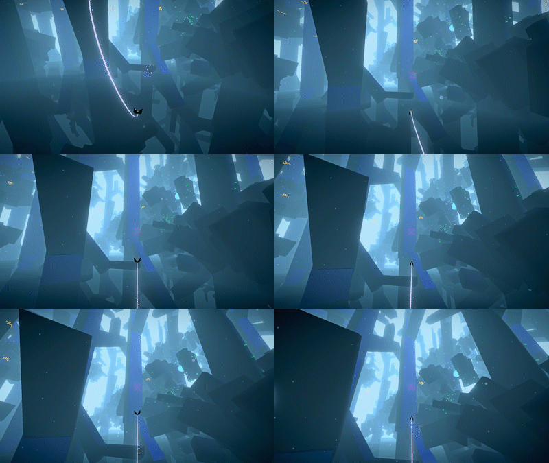
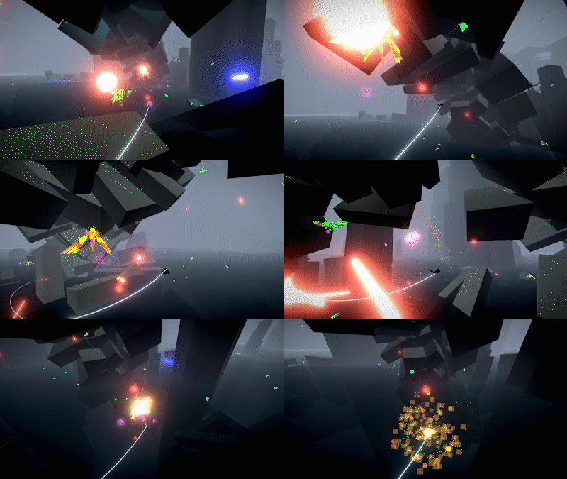
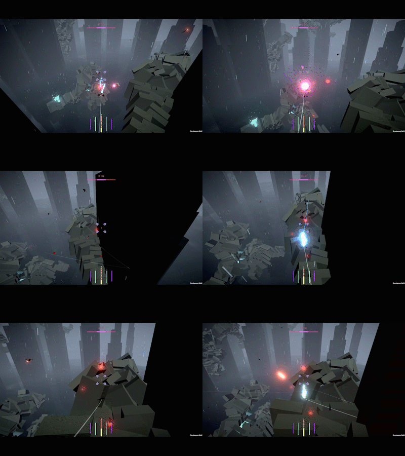
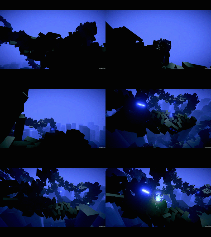
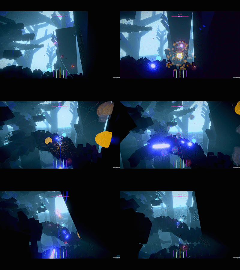
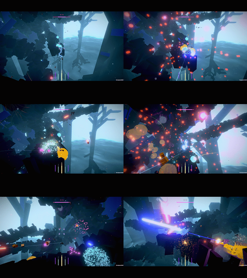
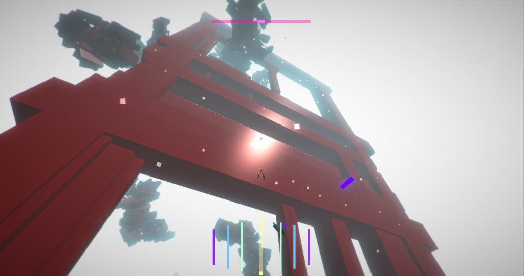
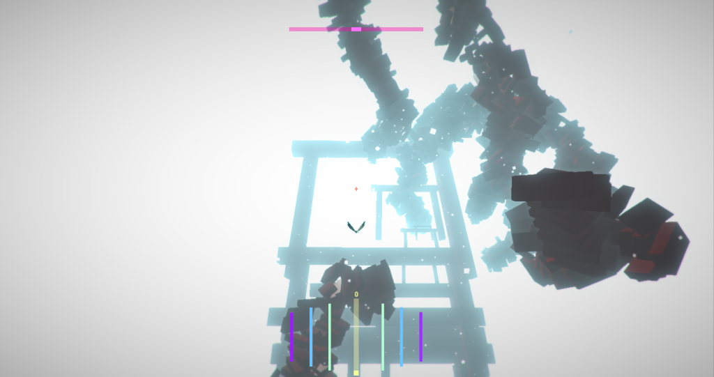
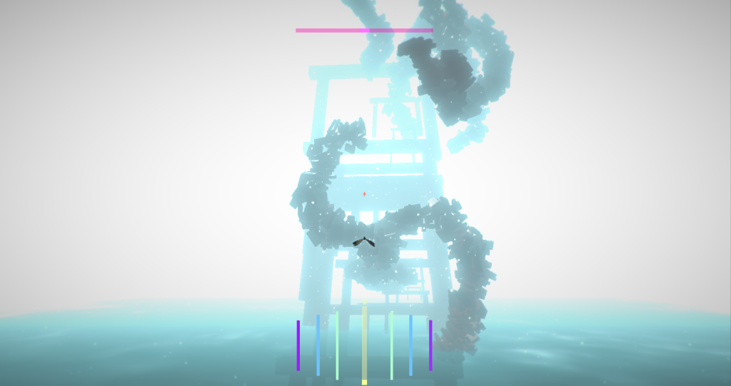
I’m happy to finally be able to share a big new addition to the world of Monarch Black. Real enemy designs!
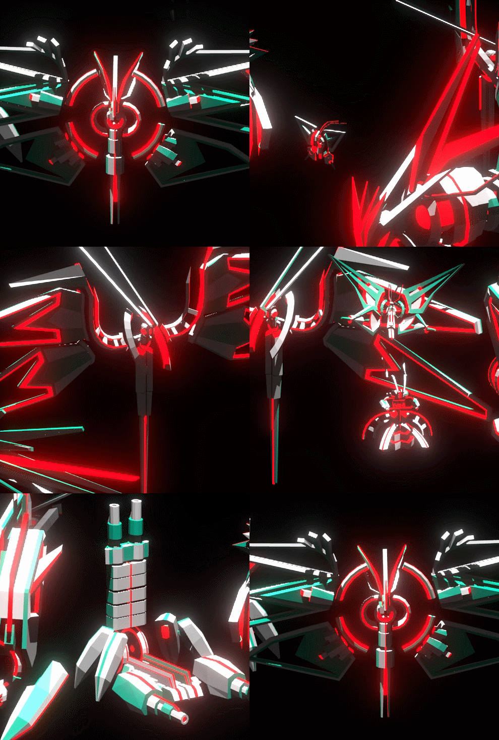
Up until now the enemies in the game have been represented by models from the Unity Asset Store. I cobbled some stuff together using various insect models and repainted the textures myself in Photoshop to get them looking a bit more stylized but fundamentally there was a mismatch between the abstract, angular world and the more realistic insect assets.
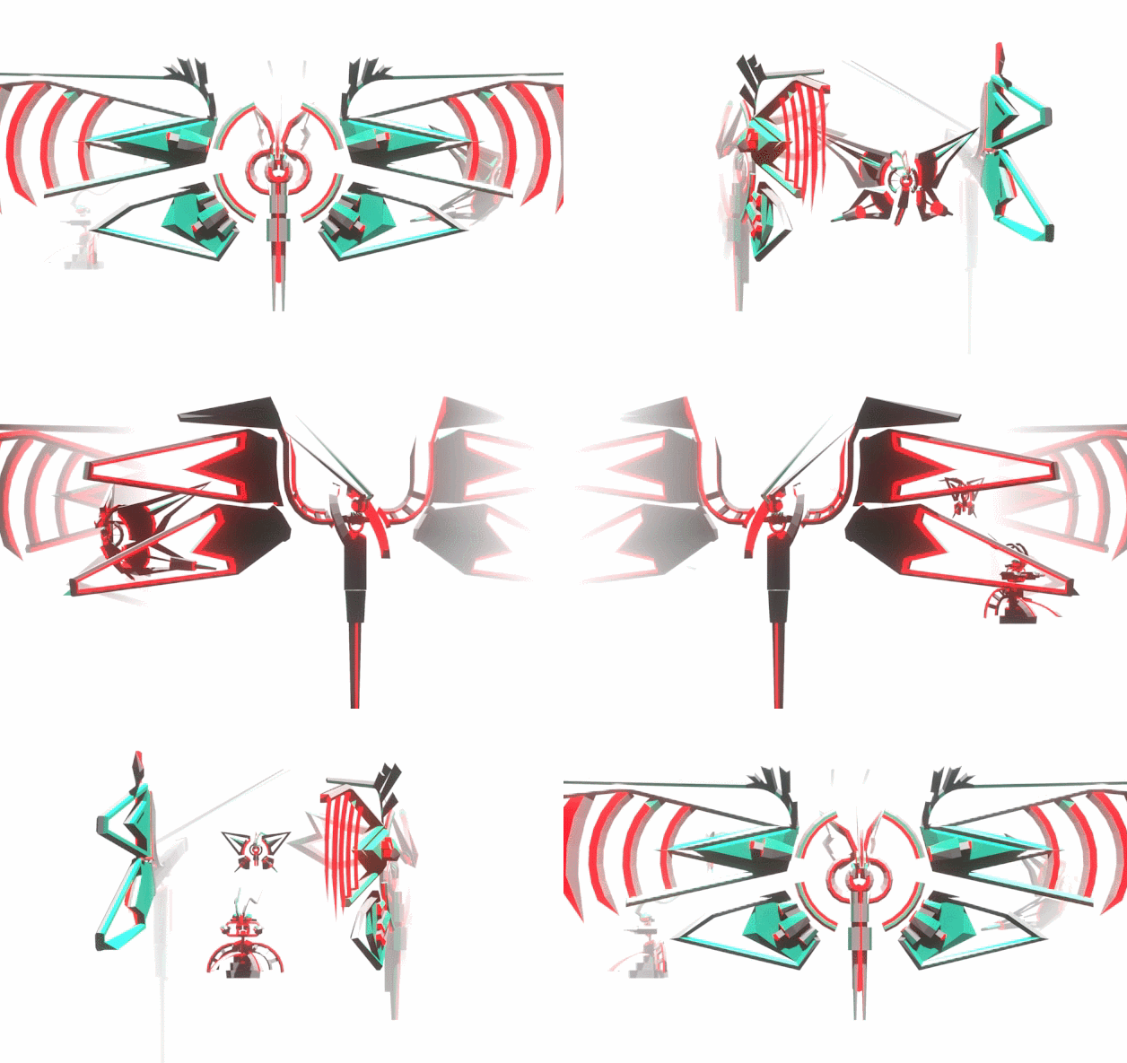
I’ve been working on the game solo for several years now and I knew at some point that I would want to replace those assets but finding the right artist to do the work was tricky. Twitter came to the rescue! I have to say that the indie dev community on Twitter has been really terrific as both a source of inspiration, moral support and a way to just feel less alone in doing something as crazy as making a game solo over multiple years. It also lead to me discovering the work of Ethan Redd aka Kid Raddical.

I immediately admired his bold, colorful low-poly art style and saw in it a potential match for the world of Monarch Black.

This is Ethan’s personal project Blazing Legion. Sick.


I had some money saved up from a tax refund sitting in my savings account and saw that Ethan was taking contract work. I decided to hit him up. It felt like a fairly significant plunge because up until now I’ve done literally everything on the game myself and really have not invested any significant funds into production. Now, as I reach the later stages of production and am getting happier with the state of the game I felt like it was time to spend some money and try to bring the quality level of the enemies up to that of the rest of the game.
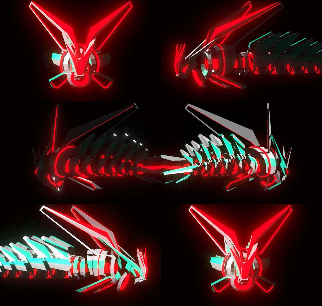
Ethan being located in New York state (like me) was also a factor since I prefer to at least meet up once or twice in person with folks I’m collaborating with. I feel like building a personal rapport and some degree of trust goes a long way when working together. We planned out the job over email and Slack and I wrote a 25 page google doc which laid out my thinking about the design. Basically it was ‘abstract origami robot bugs with some japanese mecha influence’.  We started homing in on some designs and figuring out the style based on this document as a starting point. Over the course of the process a more explicitly robotic style emerged and we both agreed it looked really cool and fit the game nicely.
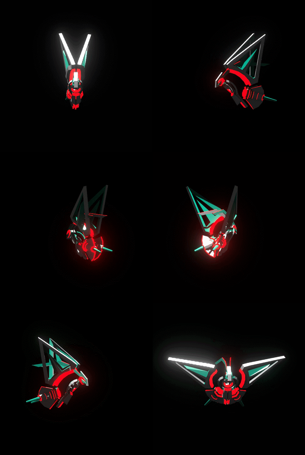
 

We met twice in NYC when he was in town for a pair of rapid, hands on brainstorming / working sessions and I felt those were really valuable. I find it’s much easier to quickly narrow down ideas in person and recommend this if possible. Remote collaboration works really well when the ideas are clear and locked. Once they know what they’re making folks can go off and work on their own, but when figuring things out being in the same room really helps. I’d say video chat could work as well if that’s all that’s possible. Ethan also streams on Twitch and streamed some of his work on the game, which I briefly joined the chat for.

In the end, Ethan has delivered a set of designs and models that I’m really happy with. For me personally having worked alone for so long there was definitely some major anxiety about bringing someone into my creative universe.  Collaborating is scary, including when you’re in the client / directors chair. What if we couldn’t come up with something I liked? What if we couldn’t find artistic common ground? Putting money on the line is also anxiety producing. It definitely made me feel less and less able to turn back, and more committed to finishing the game (which is of course a good thing). In the end, I feel that Ethan has massively raised the visual bar of the game and the mix of his artistic sense and my own has brought us to a much stronger visual place than I would have arrived at alone.
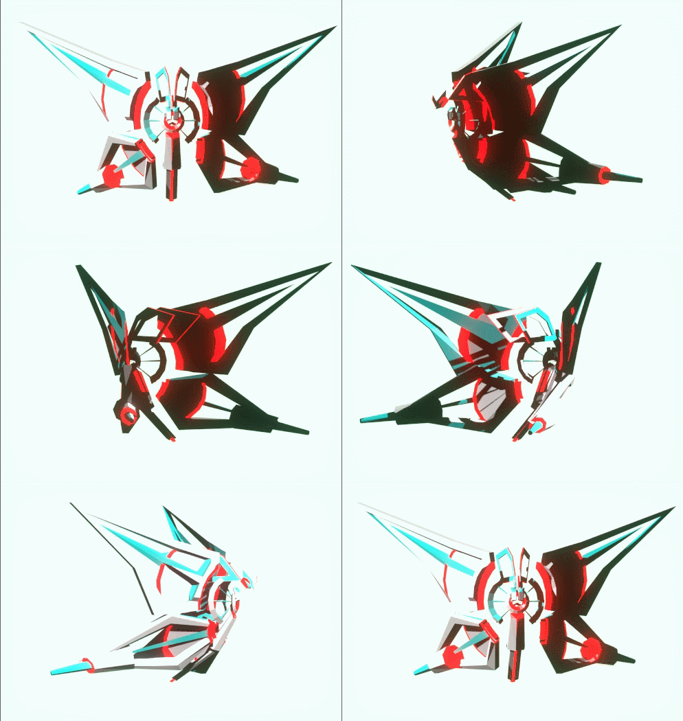
One key reason I think our collaboration was successful was that in choosing Ethan I had found someone who’s existing style I already liked. I hired him to do both enemy design and 3D art creation because I felt his existing visual style was close already to what I wanted for Monarch Black. This seems key to me, instead of choosing a random 3D artist and trying to get them to fit my style or a style I would impose on them, finding someone who’s style I already liked and could fit into the game without them reinventing themselves felt very successful. I know that’s easier said than done, but if possible it’s worth it. This in and of itself is a good reason to be on gamedev twitter and forums, to keep an eye out for cool folks making cool things that you might want to work with.

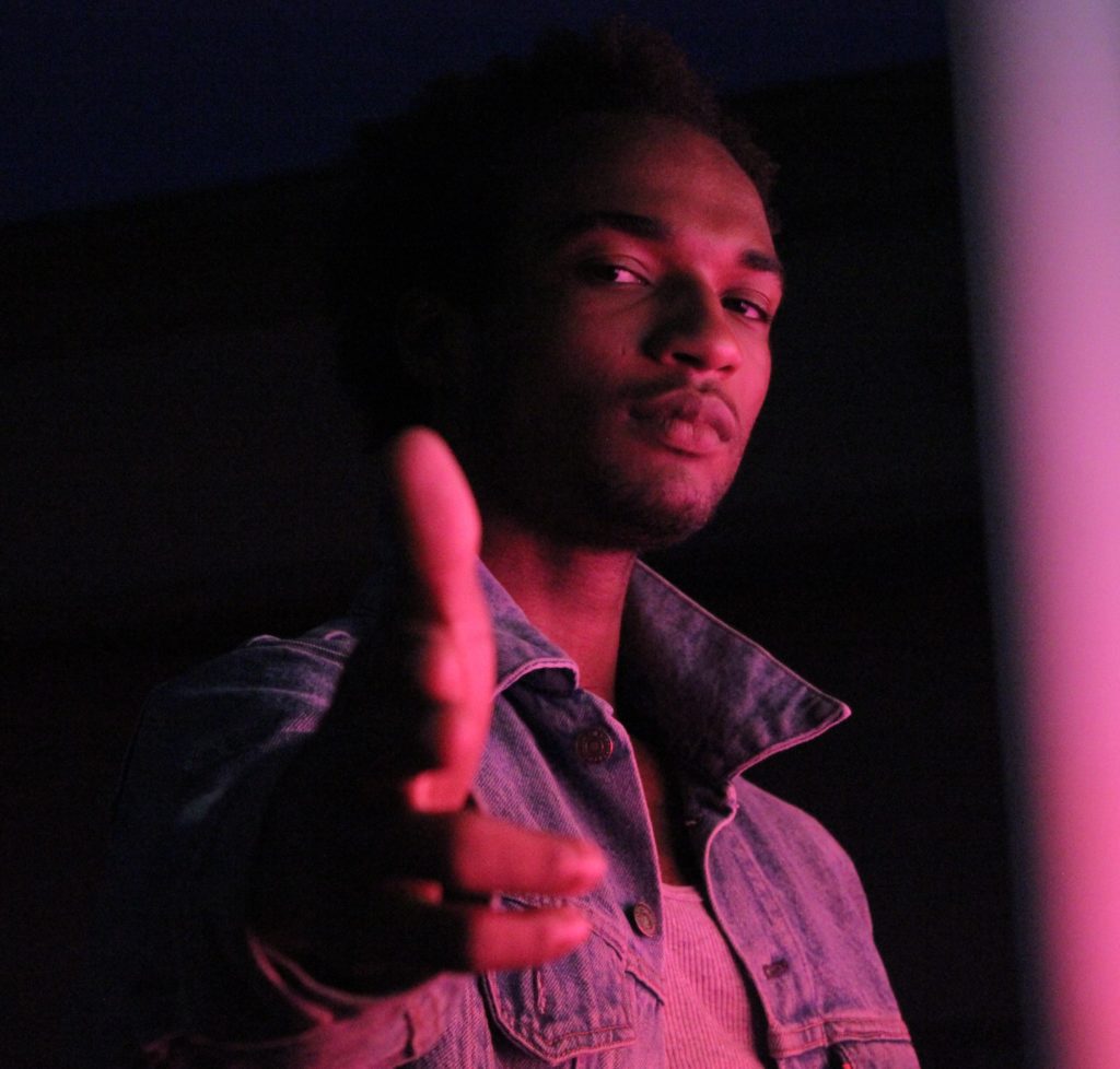
Ethan is awesome and you can find out all about him and his stuff at his site ethanredd.com.

Getting this art made was one of the key milestones for getting Monarch Black over the finish line so I feel like I’m finally entering the final phase of the game. I went through a major phase of scope expansion a few months ago which while admittedly reckless felt good and necessary. I’m now much much happier with where the game is in terms of design, mechanics and performance as a result. Getting this art done was a major missing piece. My new task lists are getting ruthlessly pared down to only include things needed for a 1.0 release of the game. I’ve got a huge list of stuff that would be nice to have and maybe add post-release and I like the idea of continuing to push tweaks and updates after the first version is done. The idea that I might do that is making it easier to cut lots of ‘nice to have’ features. Because the game is procedural / roguelike I think it evolving post-release is OK, the first shipped release does not need to contain every single possible idea ever, since hopefully people will want to play more than once. We’ll see how that goes. At the moment I’m feeling quite energized to push to the first major release. Thanks for reading!
Spring In The Air

I’m still alive! I can’t believe it’s been nearly a year since my last blog update. Yikes. Production on the game had to go into hibernation over the winter due to a combination of personal life factors, I just had zero time to work on it and so decided to take a break. Now that those factors have shifted a bit I’m back to work and taking a few months off has given me some fresh perspective and willingness to wade back in, rip out some old stuff that was sitting around that I wasn’t happy with and spruce things up a bit.

One small, but satisfying tweak I’ve made which you can see in this GIF is the additions of lines which visualize items begin effected by the players gravity field. Previously collectibles items would magnetize towards the player when within a certain range, but there was no real visual feedback that that was happening. Now a line is drawn to each item so that you can see that you’ve grabbed them. I also added a game design tweak which is that shooting deactivates the gravity field, so that if you grab a bunch of things and are waiting for them to magnetize to you it can create some interesting tense moments where you have to hold off firing at enemies. It also opens the door on some interesting physics gameplay where objects grabbed and then released by your gravity field can be sent flying in new directions. I’ve got a few ideas for ways to explore that further.

I’ve re-done the AI system, now on it’s third iteration. The previous configuration exhibited the enemy behavior I wanted but was getting crusted with random code and edge cases to achieve all the behavior across the different unit types. In the course of my day job at Unity I came up with a pluggable AI system based on ScriptableObjects, inspired by Richard Fine’s excellent Unite talk about them, and over this past weekend I pulled out the old C# interface based system and replaced it with this. The new system already reproduces all of the behavior of the old system and is much cleaner and much less tightly coupled in bad places. The hope, and my belief is that I will now be able to add more enemy types with different behavior and that the authoring process for them will be less painful, thereby helping my motivation to do it. When the code is stretched and creaking the thought of authoring new AI types inside it is kind of daunting and I felt it leading to me not doing it, so we’ll see how this new system works.

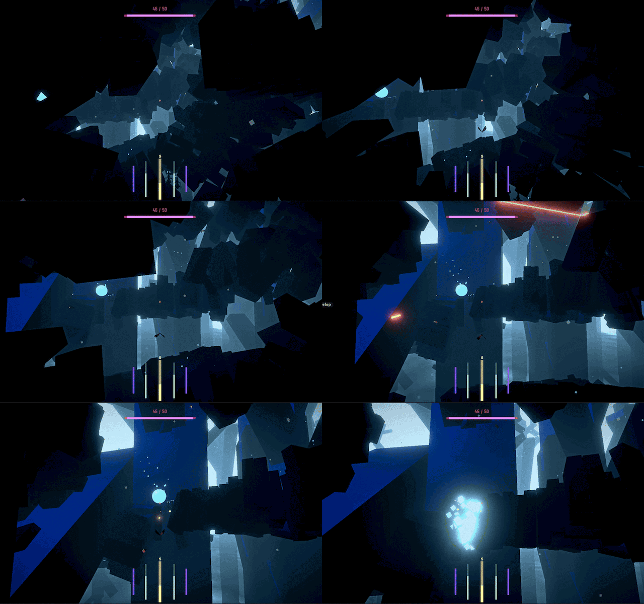
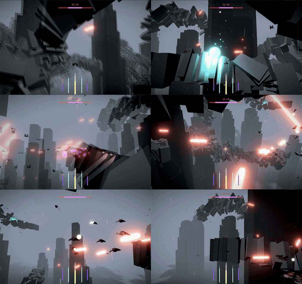
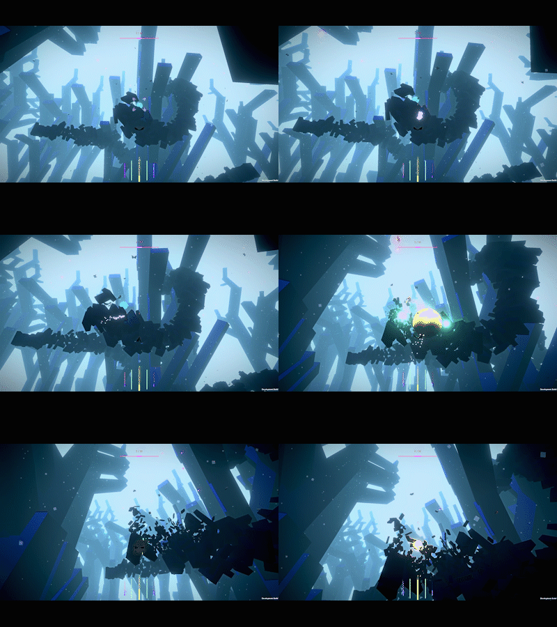
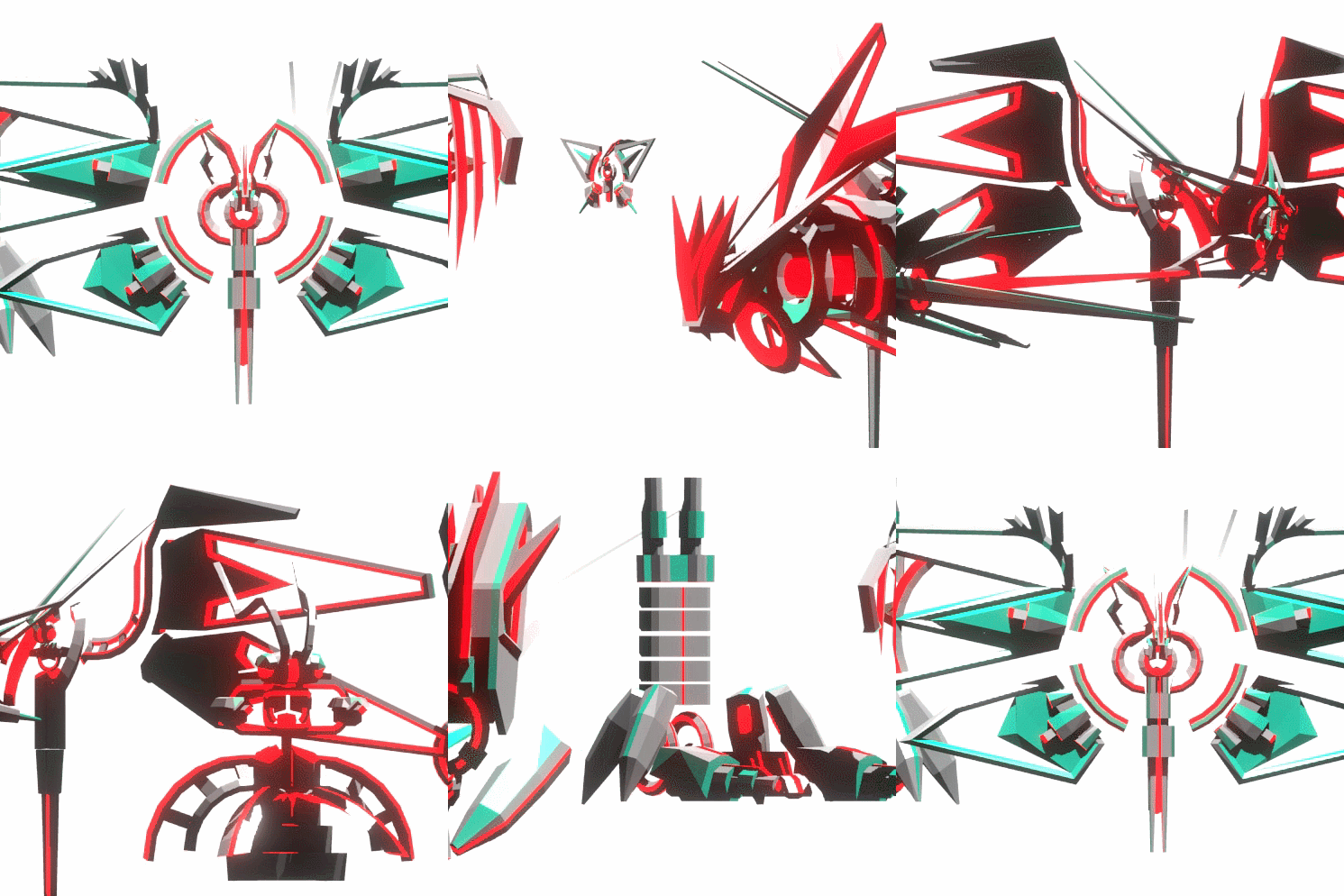
I’ve also hired an artist to work with me on the project. I was getting good feedback on the overall visual aesthetic and general art direction, which I am continuing with, but the lack of artistically coherent visual assets, particularly for enemies was really getting me down. I became aware of Ethan Redd’s work through Twitter, learned that he was also in New York and decided to reach out about getting him involved. He and I have started getting the ball rolling on some new enemy types, some of which you can see in the GIFs here. It’s great to have someone to collaborate with and I love Ethan’s personal aesthetic so I’m looking forward to working further together.

I’m in a weird place right now where I can see the finish line or A finish line in sight and now I feel challenged to make a lot of decisions and really question some of the things which I previously thought were ‘good enough’. Also now that it’s literally been years I’ve been working on this thing I feel more pressure to polish off any rough spots and really try to make it as good as I can. That feeling is a little scary because it feels like it could lead to the ship date getting pushed further and further into the future so at this stage I’m trying really hard to narrow in on doing things I really need to finish. I do feel that it’s getting there, and that the game is in better shape than it ever has been in many ways that really count. But what a long strange process it’s been.

Monarch Black Video Blog: April ’16

I’ve done a lot of new work on the game! Going to GDC for Unity was very inspiring. I saw a lot of great projects and met a lot of great people and came back with a fresh energy to work on the game, and to make big improvements. I went to a party at GameNest, a great game focused coworking space and met Daniel Cook, one of the game designers at Spry Fox. We had a great conversation about design, prototyping and iteration and I had a few minutes to show him Monarch Black. He gave me some great critical feedback (mainly that my steering was kinda sucky) and that gave me a nice kick in the pants to come back and tear out a bunch of old work and improve things.  Once I got a new steering and aiming system in I was feeling like the overall moment to moment gameplay was a little linear and stale. This lead to me doing a total overhaul on the enemy unit’s AI. I actually used a model that I taught in a live training session for Unity, which you can find here. Funnily enough I had designed and taught this system (with the help of my programmer co-worker James, who is a much better coder than me) but hadn’t integrated it into MB. In the process of trying to add some new behavior to my enemies I was running into the limitations of the terrible old code that was driving their behavior so I decided to rip it all out and re-do it using the state pattern / interface model from that training. I’m pleased to say that it works really well!

At GDC I went to the book release party for Derek Yu’s ‘Spelunky’. He read from the book and the section he read is actually one of my favorite parts of the book. He is talking about Legend of Zelda, and about how at times the game can feel indifferent to you, and how this feeling of indifference can allow the world to feel more alive, since it’s not all  centered on and focused around the player.  This is in contrast to the more theme park style approach of later Zelda games in which every moment feels carefully designed to guide and entertain the player.

Part of the feeling I want to create in Monarch Black is of being in these alien, sublime environments. I don’t want the player to feel like the sole, god-like entity in this environment, but instead one of many actors.  Another thing which Yu mentions in his book is the idea that in roguelike games, the player and the enemies should live by the same rules and be able to interact with things in the same or similar ways. This concept really rung true for me and lead to a lot of my thinking about refactoring the AI in Monarch Black. Now, when a sphere plant explodes and the pollen grains fly out, the player and the enemies have to scramble to collect them all, and if the enemies get there first, they’ll take them from the player! This adds an amazing, dynamic moment to the game where suddenly the player has to respond to changes in the game that they may not have instigated.

Getting to this moment of the player and the enemies following similar rules and behaving required massive refactoring of the existing systems and I had to throw out a lot of old code. Happily, the new code is much cleaner and has opened up whole new sets of creative possibilities in the game that have given me a fresh burst of motivation for working on it.

I recorded a video of me playing the latest version of the game, which is full of bugs. I said I recorded the video to avoid writing a long blog post about my recent work but now apparently I’ve done both. ¯\_(ツ)_/¯


Beach

beach2

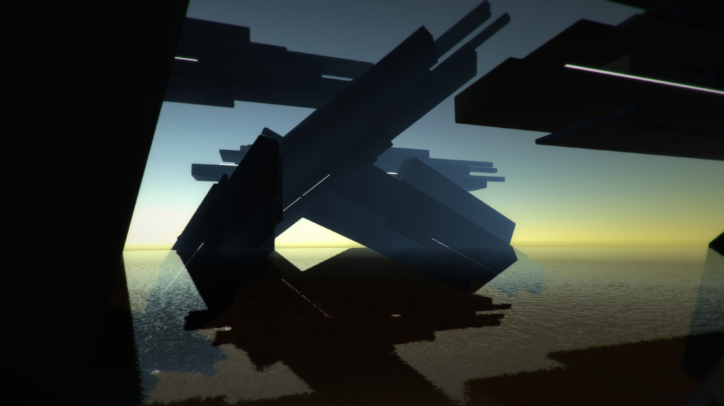
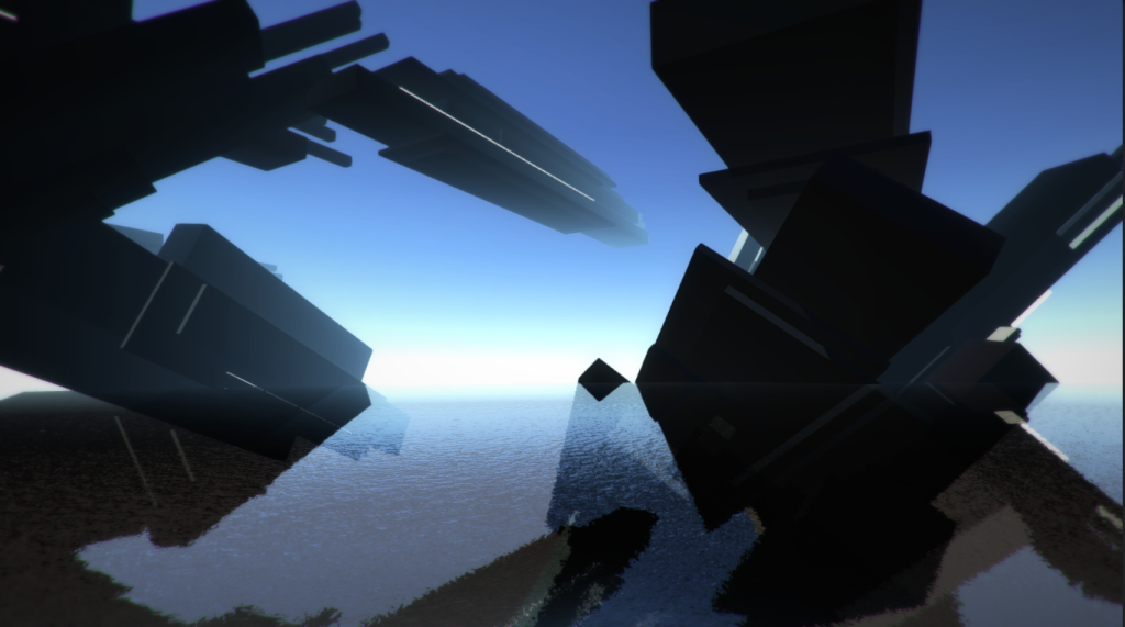
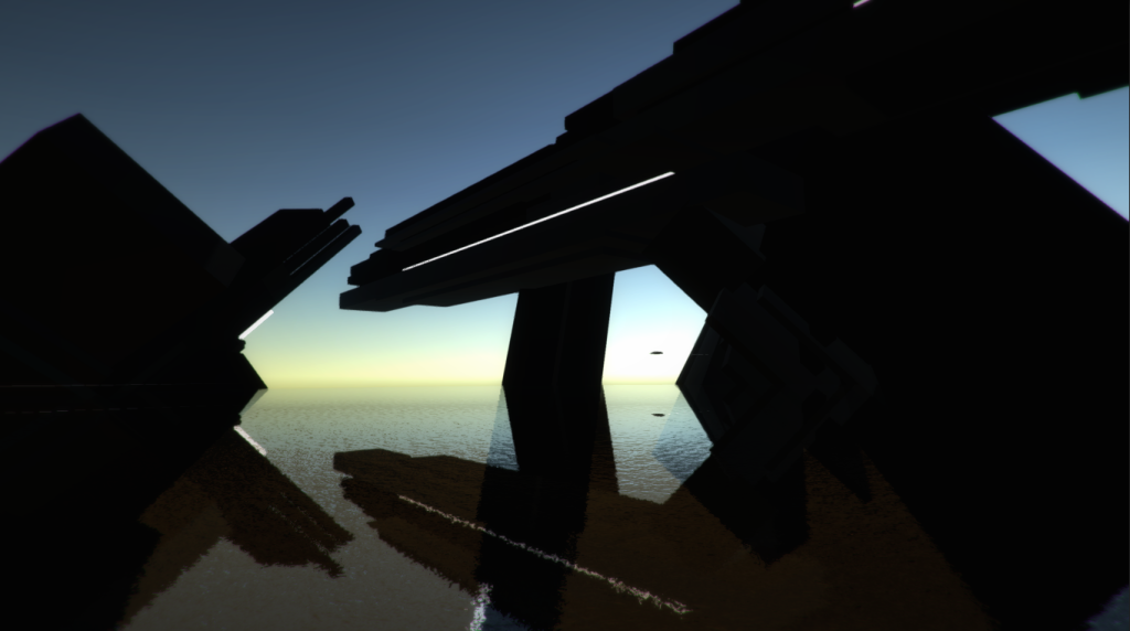
This past week I went to Brighton, England to visit work colleagues at the Unity office there and got stuck. The #snowpocalypse hit the east coast and New York City was snowed in. My flight was cancelled and so I found myself with a quiet weekend on my hands. I’d noticed a few weeks ago that #screensaverjam was happening and loved the idea but figured I wouldn’t be able to participate due to scheduling. The idea of making something using game tools that was non-interactive and just about creating nice visuals felt really liberating. I thought about a few ideas I might like to do and then remembered a raw prototype I’d made from the summer, Beach.

I love to read science fiction, especially some of the more recent generation of space opera, people like Iain M. Banks and Ann Leckie. I love the broad, expansive feeling of intelligent space ships travelling through vast spaces and all the strangeness that may arise.  This lead me to the concept for Beach. I wanted to make something which would capture some of that awe inspiring feeling, of space, distance and smallness. The original idea was to have a simple beach that the player was positioned on and then watching as procedurally generated spaceships arrive and depart.  In the process I realized that having some framing geometry, buildings between the player and the ships would make things much more visually interesting and so began to add some very random ‘building’ like alien megastructure things to act as frame and foreground for the floating ships.

I built the project in Unity, and used some simple primitive based geometry and textureless materials. I like the feeling of abstraction that this affords and it also makes it fairly easy for me to create evocative visuals relatively quickly using simple colors and shapes.  I initially attempted to use some procedural color palette tools I’d created but wasn’t too happy with the results. At some point the tool flung up the predominantly blue palette that is in the current version of the piece and I turned off the color switching and decided to stick with that pallette.  This combination of using procedural tools as a kind of ‘collaborator’ which throws up ideas which you as the creator then edit is pretty interesting. I’d like to explore this technique further in the future, a combination of procedural generation and human selection and editing.

I originally had a first person style controller in there so that the player could turn and look around. I removed this for the #screensaverjam version and replaced it with a simple, slow rotation for the camera. I actually prefer this approach as it gives the piece a more sweeping, cinematic feel.

beach3

In the original prototype I had experimented with having the ship geometry being animated in response to playing audio in the scene. I scrapped the idea for this version as it didn’t end up being very interesting. As scratch audio however I had used an album created by Autechre side project Gescom titled ‘MD’ which is a collection of ambient and noise works released on minidisc and designed to be played on shuffle, creating an aleatoric, randomly generated sequence. I’ve done several works in the past which attempted to explore this concept further, cutting and shuffling between audio files, and thought this would be a cool chance to pursue it.  I recorded a series of very rough, loosely tonal improvisations using a physical modeling synthesizer. I selected about 12 takes from these and wrote a script in Unity to mix slowly between them at random, selecting and playing two at any given time.  I’m fairly happy with the results. At times it throws up some nice combinations and I feel like the slightly abrasive, unsettling textures and tonality of the audio matches the alien mood I wanted for the piece. I was hoping to create the feeling of being far from home, surrounded by giant alien structures which are completely impassive to you.  I feel that at times the audio conveys that well. Given some time I might return to it and edit the tracks a bit more, clean up some of the obvious glitches and errors. Part of me also just wants to leave them and have that be part of the user-hostility of the piece. I’m undecided.

I do have a game idea which I’d like to explore that’s set in this world. Loosely speaking it’s a networked multiplayer information and economic warfare game in which players inhabit a space port and try to out trade and spy each other, responding to what ships arrive and depart. It’s probably stupidly ambitious and I’m not sure if I’ll ever get to pursue it. At the very least I need to finish Monarch Black first. I would very much like to attempt a networked multiplayer game in the future though, maybe for the project after MB so we’ll see.

You can download either a screensaver only version of Beach or the version with the audio for free on my page at itch.io.

beach1

Promoting Your Game With Animated GIFs

Why Use GIFs?

As indie developers more often then not it falls to us to market and promote our own games. There are many ways to do this but one of my favorite is to use animated GIFs. Video games are an art form of moving images (mostly!) and if a picture is worth a thousand words an animated GIF is worth 80 to 100 thousand words.

Seeing your game in motion is a great way for people to get an idea about what it will be like to play it.  I’ve found that the amount of interaction and interest I’ve gotten for my game Monarch Black on social media has increased the most at two key points: The first was when I started participating in the #screenshotsaturday hashtag on Twitter posting still images, and the second was when I switched to regularly posting animated GIFs, instead of stills.

Twitter is a great place to post GIFs but they’re also great for development forums like TIGSource’s Dev Logs area or your own dev blog. When people are scanning a feed or thread, the great thing about GIFs is that they automatically start playing, and looping as the user scrolls past. This gives your game a chance to reach new players that weren’t keen enough to click through a YouTube link, but might become interested seeing your GIF at a glance. In a conversation on Twitter with Jonathan Holmes of Destructoid he suggested to me that a simple email with a nice GIF embedded in it might be a good way to quickly capture a writers attention, and get them to click on further links to learn more.

For players and press, there’s very little friction in viewing a GIF. You know it’s going to be short, you don’t have to wait through ads and you can instantly see some piece of a game.

Easy Tools

There are a number of simple tools like Gyazo and GifCam which may be all that you need, depending on how involved you want to get. Both of these are stand alone applications designed to allow you to record things on your screen and output directly to GIF. What they lack in complex features or output quality they make up for in ease of use.

Visual Snacks

Now a little piece of advice. It’s possible to get very fussy about creating perfect, beautiful GIFs of your game but I would advise that this is a mistake. There are places for trying to make things perfect and beautiful, like in your trailer. The trailer is a piece of content that will be used in many places, hopefully seen by many people and will be a key selling tool for your game. The fun thing about GIFs is that they are ephemeral and a bit disposable. They’re like little visual snacks that you can sprinkle into your promotional efforts for your game.I think this is a strength of them as a medium and therefore instead of obsessing over quality you should focus on quantity.

Work Flow

This is where work flow comes in.  Making and sharing GIFs, especially if you obsess over them, can be surprisingly time consuming. When you’re a one man band like me you want the time consuming thing you do to be making your game more awesome, not tweaking GIF compression. So! Here is a work flow that I’ve found works for me and allows me to produce the quality of GIF I want and seed them into the world.

Capture

First, I capture HD footage of my game using Open Broadcaster Software. OBS is an awesome tool. It captures great looking footage, allows you to stream on Twitch if you want to and is FREE. Tough to beat. I’ve used other capture packages like Screenflow (Mac only) and while it can be nice to have editing functionality in your capture software I’ve since switched over to using OBS and a Non Linear Editing (NLE) package instead. In this case because I have an Adobe Creative Cloud subscription I’m using Adobe Premiere for video editing.The settings I use to capture in OBS (which aren’t super important, but I’ll share for completeness sake) are as follows:

  • Mode: File Output Only
  • Resolution: 1920 x 1080
  • Max Bit Rate (kb/s): 8000

I’ve gotten in the habit at the end of a dev session to make a build of the game and capture myself playing for half an hour or so. This has a few benefits. First, I’m capturing high quality video footage regularly which I could use in other video content (like a new trailer I’m planning to cut soon). Second it forces me to play the game differently and focus more on playing and less on bug seeking and note taking. Third it gives me lots of material for GIFs!

Once I’ve got my footage captured I drop it in my NLE, in this case Premiere. I then go through the captured footage and find five or six nice moments that show new features, look good or whatever my goal for the GIFs are. I mark in and out points and then export this directly to GIF using Premiere’s Animated GIF export option.

The most important venue for my own GIF output thus far has been Twitter so it’s important to make sure that any GIFs I am authoring can be posted there, along with wherever else. This means that I want all of the GIFs I am creating to be between 3 and 4 MB in file size. The variables that we have to tune are resolution, frame rate and image quality. It’s important to note that depending on the visual content of your game your mileage may vary but I’ve found a sweet spot with the following settings in Premiere.

  • Length: Under 5 seconds (usually aim for 4 seconds 20 frames)
  • Resolution: 500 x 280 or 400 x 300 (which results in letterboxing, see below)
  • FrameRate: 20
  • Field Order: Progressive
  • Aspect: Square Pixels

This generally results in a GIF that’s around 3.8MB give or take which I find gives me a nice balance of quality to file size.

I’m currently doing this on Windows. My understanding (correct me if I’m wrong!) is that  the Animated GIF export option is not available on Premiere on OS X. On Mac I’ve gotten very good results using GIF Brewery.  GIF Brewery actually has more control over the output and allows you to tune the compression and get it looking better. I found this lead me to obsess over tweaking it which slowed down my output a bit, and my main dev machine is a Windows box which is why I shifted over to my current workflow. GIF Brewery is a great option though if you’re on Mac. I learned about it from a tip from Justin Pierce on Twitter, and he’s actually done a good post comparing different compression settings with it on his blog.

Scheduling and Posting

The last bit of the workflow is posting them to Twitter. Of course this can be done using the regular Twitter web client, but I’ve found that using Tweetdeck has a few advantages.

The main advantage is that you can schedule GIF posts. I love this since being consistent about posting things regularly is hard when you’re working on your game or taking care of the rest of your life. This allows me to sit down, make a batch of new GIFs, set a posting schedule and then come back periodically to find a bunch of notifications (the Twitter ego equivalent of cocaine pellets for experimental rats).  To schedule tweets on Tweetdeck first hit the compose button, add your image (do this before writing so you know your available character count), compose your message, add your hashtags, and then instead of hitting the ‘Tweet’ button, press ‘Schedule’ and choose a date and time.  It’ll appear in a Tweetdeck column showing when it’s scheduled to go out on the right. Don’t worry if later scheduled tweets don’t show the GIF preview, it’s there.

As far as hashtags to post to I like #screenshotsaturday, #gamedev, #indiedev and #indiedevhour. The communities around those tags are generally very nice, supportive and happy to like and retweet your stuff if they dig it. These tags are public free spaces so please don’t spam them or abuse them! I won’t put forward a rate for how often you should post to them but I do see people setting up armies of bots all tweeting the same thing in there and I block them. Don’t be that guy (or girl, or bot). Also, if you’re using those tags, retweet and like some of the cool stuff you see! I’ve met a lot of interesting people online just cruising those tags and helping to signal boost other people’s stuff, and other people have done the same for me.

Questions?

Hopefully this has been helpful for you! If you found it useful or have questions feel free to hit me up on Twitter, I’m @mattmirrorfish.  The GIFs in this post are from my game Monarch Black which is currently in development. You can learn more about it at my website, mirrorfishmedia.com

Monarch Black: December 2015

OMG Another Year Is Over

It’s been a busy month! I’ve added a bunch of new features to the game, some of which I’ve made animated gifs for (see below). I’ve got a decent workflow for making GIFs now and that’s sped up the process. Sharing GIFs on Twitter has been helpful in helping more people to know the game exists and so I’ve tried to be more consistent with that.  Working a job, taking care of my kids and working nights on the game means that I have to prioritize key activities and lately that’s been development work on the game.  The past week I’ve had a few days off work and so been able to really dig into development and fix and add a bunch of stuff I’ve wanted to for a while.

New Beam Weapons

The shooting in Monarch Black has always used physics based projectiles. This means that it’s not instantaneous. You shoot, an object flies from you to the enemy and hits them, or not. I like the feeling this gives to combat although I think it makes shooting a bit more difficult. Sometimes you have to lead your enemies a bit (shoot where they are going to be) if they are far away. This also allows me to do things like homing bullets, bouncing bullets and a few other fun features that I really like.  But I’ve been curious what the game would feel like with raycast based weapons. Raycast shooting means that you click and an invisible ray is fired from your gun into the scene, it checks if it’s hit anything and if that thing is an enemy it applies damage. The feeling this gives is that shooting is instantaneous. You click and the enemy takes damage right away.  As of now, I’ve added a new category of weapons, beam weapons, to allow for ray cast based shooting in addition to the existing physics based system.

Here are two GIFs of one of the beam weapons, the Arc Lightning weapon. What makes it unique is that it bounces off things that it hits and can ricochet and hit other things.

Arc Lightning 1


Arc Lightning 2

More Mutations

I’ve also been working on adding more mutations to the game, powerups which you can choose from between levels.  A few of these include:

Death Rockets: these give a chance to spawn a volley of rockets in random directions when you kill an enemy, here’s a GIF.
Death Rockets

Blood Lust: This gives a chance to create a shell of spikes around you when killing an enemy which damage nearby enemies. In this case it’s combo-ing with Death Rockets and going a little crazy. Not sure if you’ll be able to combine these in the final.

Blood Lust

Enemy Tracking

Thanks to some feedback I got at the NYU Game Center play tests on Thursday nights I decided to try implementing a system to show you where nearby enemies are that you can’t see. I’m pretty happy with how it came out. It makes the game a little more video game-y but I think it looks nice and allows me to make the game more challenging without feeling unfair. The action games I love most are hard and I’d like to get there with MB. This helps so I think it’s here to stay. In the GIF below you can see the red triangle icons appear when an enemy is in range and point towards their location, growing brighter as the enemy gets closer.
Enemy Tracking

That’s it for now! My next goals are to keep working on the game, do a few more dev streams on Twitch which have been pretty fun so far and to try to post more regular updates.

MONARCH BLACK TRAILER

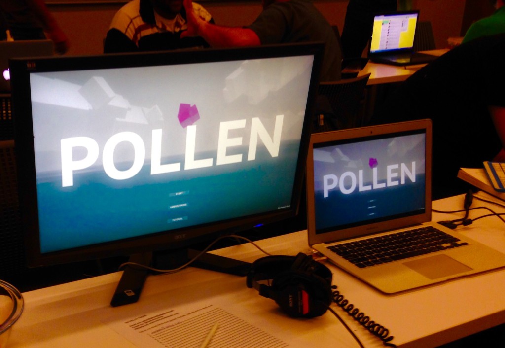
I made a trailer! After much procrastinating I finally got to the point where the game looked mostly the way I wanted it to and so I captured some footage and cut it together. The music track is for the last stage in the game, a new piece I wrote over the summer.  Also, I’m trying out the title Monarch Black to replace Pollen. There’s another game called Pollen (which looks great) and I don’t want people to get confused. I’m gonna roll Monarch Black around for a while and see how it sits with me.


Pollen GIFs & Tings

I took some time off from programming and designing on Pollen and focused on the music a bit. I’ve got three new tracks done for the new desert level, a new track for drowned city and a track for the last level. I feel like I’m getting closer on the vibe of the music that I want and things are sounding pretty good.

Before showing it last time at Playcrafting I spent some time doing color correction and image processing on each level and I think the look is getting a lot closer to where I want it to be. I got a few nice color and image post effects from the Unity asset store and that’s helped things quite a bit. I highly recommend the Colorful and Chromatica packages from Thomas Hourdel. I also got a very nice bloom called Ultimate Bloom by Paroxe which is really making the lasers pop and helping the look overall. So far this is probably my favorite Unity bloom effect I’ve used.

I’m showing again this weekend at the Bushwick Film Festival in Brooklyn so I’m doing a push this week to get everything updated and ready. I’m also getting closer to figuring out a launch plan. I think I’m going to go through Steam Greenlight. We’ll see how that goes.

In the meantime, have some GIFs:

drowncity_320_64_random

pollen_snow_400_96_20fps_random

BETA

Screenshot 2015-05-23 13.33.49 Screenshot 2015-05-23 13.34.31 Screenshot 2015-05-23 13.34.55

After showing last month at Playcrafting NYC I got some really good feedback and so have been working hard to implement it and get the game in a state where I can send it to people to play. I just finished sending out the first batch of emails with links to a build of the game and hopefully will get some good feedback back from those (or any feedback!)

The stuff I’ve been working on has been fairly nitty gritty and not super exciting, stuff like Xbox 360 controller support, a pause menu and tweaking the difficulty curve. It’s sobering to realize how much work goes into creating what we often thing of as a basic, working piece of games software and how little we think about stuff like pause menus, sound options, etc. There is a lot of work in making a video game beyond making fun game play.

I’m also starting to try to nail down a release plan, something I’ve been toying with but not really committed to. At the moment the basic plan is to try to gather some feedback through a closed beta and then put it up on itch.io to do an ‘early access’ style open beta and get some feedback from players in the wild.  One thing I set up was some simple analytics using the Unity Analytics beta to report back basic game statistics. It’ll be interesting to see how that works and if the variables I’m tracking are useful.  The ones I’ve got in there so far are:

  • hitpoints at start of level
  • hitpoints at end of level
  • time to complete level
  • enemies killed
  • mutagen resources collected
  • player level

My hope in doing this is that if people check out the build and don’t give feedback I’ll at least be able to gather some data. I saw a cool talk from the guys working on SubNautica (which I haven’t played yet but is on my Steam wishlist) about getting players to report how much they’re enjoying things, send screenshots and give other notes about the game. You can watch that here:

Moving into this stage of the game’s life where it’s getting closer to being finished and needs to start entering into the world is pretty terrifying. I’m feeling a lot of psychological internal resistance (aka fear) at each step. At these kind of moments I wish I had a partner or collaborator to talk through this stuff with and to help keep spirits up. Working on your own it’s easy to feel insecure about what you’ve made. My girlfriend has been pretty helpful in pushing me forward and boosting my confidence. That combined with the fact that I really need to try to monetize this project after putting almost two years into it! Regardless, I’m happy I haven’t given up and am taking myself through all of these different parts of the game making process.

If you’d like to get on the closed beta list, please send me an email! I’m mirrorfishmedia AT gmail DOT com.


PUBLIC TESTING

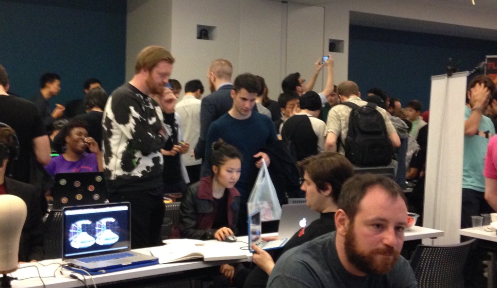
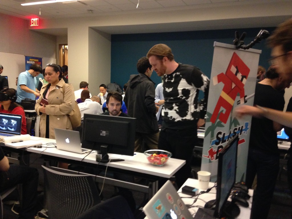
I did my first public play test event. This was at Playcrafting here in NYC, at the Microsoft offices. Boy I’ll tell you: play testing is hard, hard, hard. I felt nervous, sweaty and constantly wanted to tell people: “No, you’re playing it wrong!” I wanted to grab the controls from their hands. I also had some pretty serious impostor syndrome, feeling like I didn’t belong there amongst the more finished, more polished games and people with their posters and well organized booths and general having-of-their-shit together. But the event was great. I got some very thoughtful, nice feedback from some of the attendees, many compliments on the visual style of the game (which is a bit surprising since I don’t identify as an ‘artist’ but there you go) along with a good amount of constructive criticism.

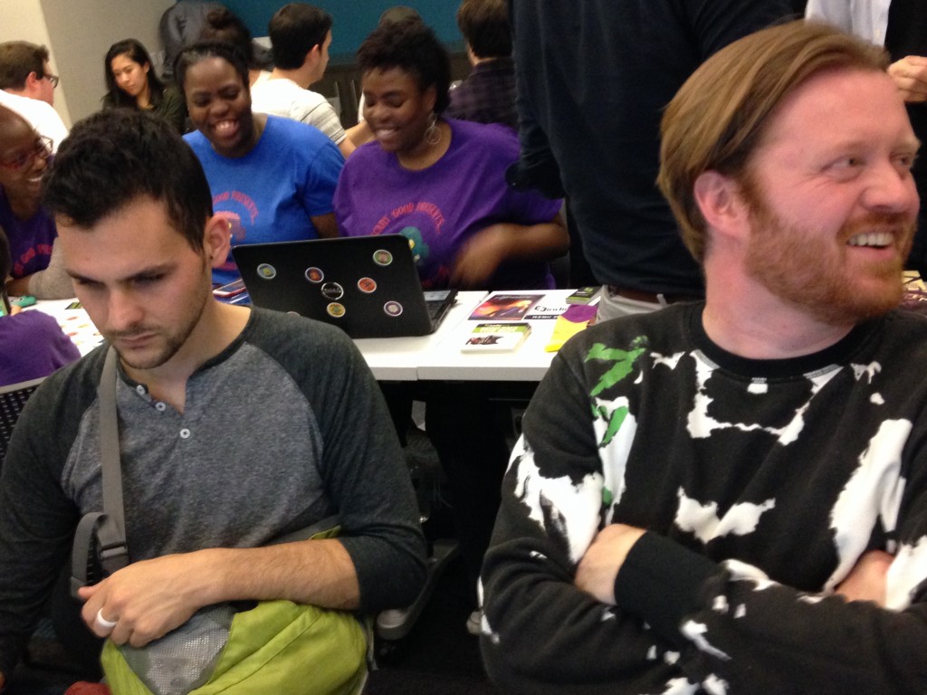
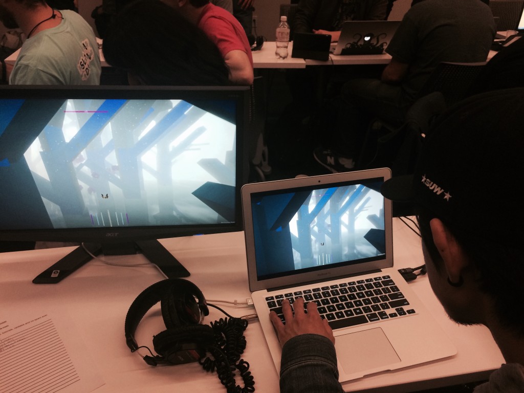
The main negative feedback was about the controls. They are hard to use it turns out. That was tough to hear, but also valuable. A few people seemed to get it and after a few minutes of playing got the hang of flying around. Still, I realize that there is some fairly significant work to be done. Getting out and showing the game to people felt really good though, and the deadline was very helpful in getting me to focus and do a bunch of stuff I’d been putting off, some of which was fairly major (like fixing the long broken game over screen). All in all I was very happy with the whole experience and would strongly recommend it to anyone considering it. I also wish I had started getting out and showing it earlier and will chalk that up to a lesson learned. Here are some pictures! I’m the tall guy in the black and white sweater. The last pic is of me and Simon the artist from Mushroom 11 which I got to play and was very impressed with, a super innovative mechanic and generally very interesting (and great looking) game.


FullSizeRender-1  Version 2 FullSizeRender-5 IMG_0472 IMG_5294